My homepage has two secret doors
Tear a boarding pass and fly to an island. Open a MacBook and boot into an OS. Two ways off the page, both animated as one continuous move.
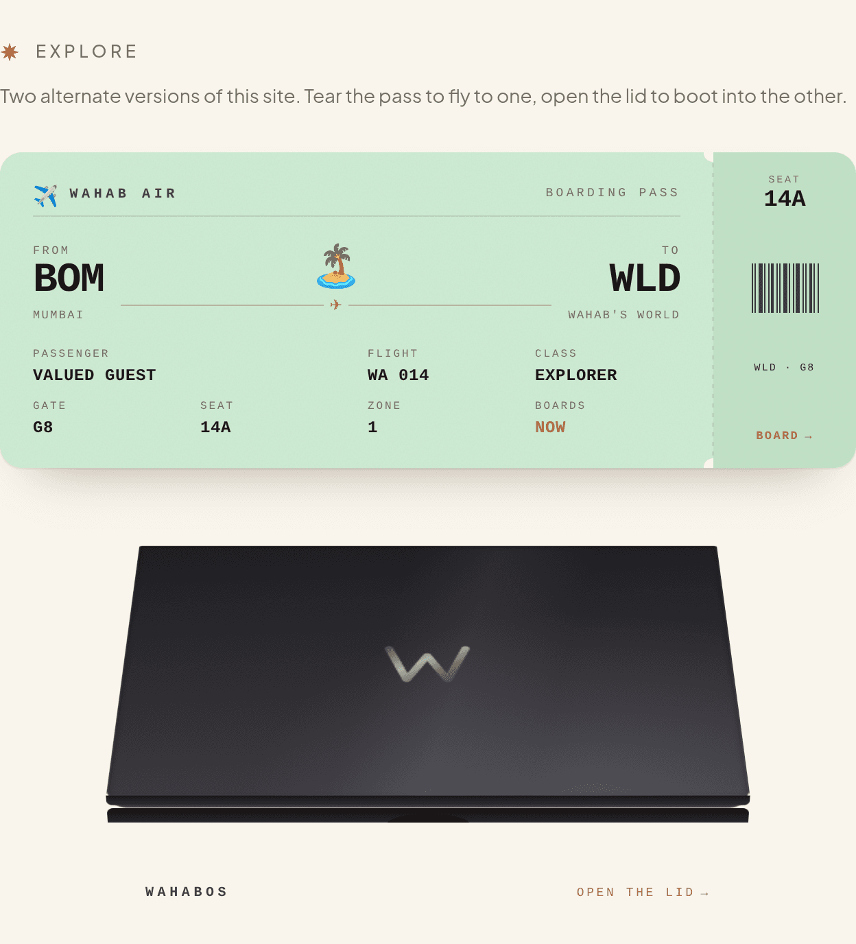
Most personal sites are one page you scroll and leave. Mine is a hub with two other whole sites hiding inside it, and the fun is in how you get there. You don't click a link. You tear a boarding pass, or you open a laptop lid.
The boarding pass
Near the bottom of the homepage there's a boarding pass. Drag the stub and it tears along the perforation, the way a real one does at the gate. That tear is the trigger. The screen floods with the colour of the pass you just ripped, a plane takes off, and you land on /world — the island village.
The catch is that the pass lives on the homepage and the landing happens on a completely different route. They can't hand off through normal props. So there's a tiny one-way bus between them: the tear announces a flight plan (where to, what colour, the flight number on the stub), and an overlay that lives above the whole site catches it.
The trick is who owns the wait
The hard part of any page transition is timing. Change the route too early and the animation cuts off. Too late and the user stares at a frozen screen wondering if they broke it.
So the overlay owns the whole move — the take-off, the route change, and the reveal — as one gesture. It fires the navigation, then holds the plane in the air until the browser confirms the destination has actually mounted. There's a floor so warm, fast routes don't blink past too quickly to read, and a ceiling so a slow one doesn't strand you on a runway forever. Turn on reduced motion and it skips the theatrics and just takes you there.
The MacBook
The second door is a closed MacBook further down the page. Open the lid and it boots — Apple logo, progress sliver, a lock screen — into /os, which is my site rebuilt as a desktop OS. There's a dock, a menu bar, windows you can drag, a Finder, a Safari with my real bookmarks, Notes, Photos, the lot. Same content as the homepage, wearing a completely different costume.
The rule I set for both skins: they have to feel like the real thing enough that the joke lands, without pretending to be useful software. It's a personal site doing an impression. The impression just has to be good.
Why bother
A boarding pass and a laptop lid are things people already know how to operate. Nobody needs a tooltip explaining that you tear a pass or open a lid. The interaction is the instruction. You reach for it before you've decided to, and by the time you notice, you're somewhere new.
That's the whole idea. Not a nav bar with more links. Doors that look like they lead somewhere, and do.